Should I stand behind the lectern?
The lectern is a staple of traditional speeches. We see politicians use them all the time, as well as… who else? Who, apart from politicians, still uses a lectern? If I had to create a 0 to 10 presentation scale where 0 is totally informal and 10 is fully formal, I would say that running naked on stage is 0 and speaking from behind a lectern is 11. Yes, the lectern is really that formal, and in 99% of the cases, that’s not a good thing.
Continue ReadingThree most annoying problems with business presentations, according to PowerPoint expert Dave Paradi
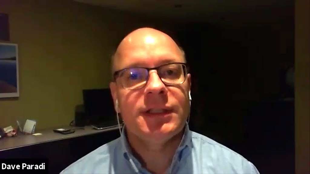
Dave Paradi, an expert on PowerPoint presentations, has published the results of the annoying PowerPoint survey. We are not going to discuss the full results here, but what is clear is that the top 3 hasn’t changed much in many years. You could probably guess them just by asking yourself “what do I hate about PowerPoint presentations?” The top three problems are: The speaker reads the slides to us The text is too small
Continue ReadingThe story behind the story

First, a mandatory disclaimer: I like Sixties-Boomer music. If poor musical tastes offend you, don’t read this. Last week, I was searching for an old song on YouTube, when suddenly I noticed a video from Joan Baez. I realized that, despite priding myself on my knowledge of 60s music, I never actually listened to one of her songs. So I clicked and listened to it. It was called Diamonds and Rust.
Continue ReadingBeing coached is the mark of true leaders

Some leaders are afraid to let other people know that they took public speaking coaching. I want to explain why it’s a mistake, and why the best leaders are proud of being coached. The Consulting Partner who hired me back in 1996, for a company that was then called Andersen Consulting, was an extremely charismatic person and an excellent orator. One advice he gave openly to his peers, and to us young consultants, was to get professional public speaking coaching to become better orators. He was proud to say that he took coaching sessions.
Continue ReadingWhat happens when two political parties use the same rhetoric?

What happens when two parties position themselves in a similar manner on the same topic? Simple: the one which is the most credible wins. By “most credible,” I mean “the one that incarnates the rhetoric with the most authenticity.” There is a mistake that has been made by many traditional parties. Some traditional parties saw new parties start to gain popularity by advocating extremist views. So they started to adopt a slightly watered down version of these views to attract voters. But they were terribly wrong. By doing so, they got doubly punished: they destroyed part of their credibility by betraying their historical values, and also managed to give a broader acceptance to these extremist views, making them more mainstream and putting extremist ideas in the spotlight. The exact opposite of what they intended to do.
Continue ReadingEstablish a Connection First

You’ve probably already seen those presenters who climb on stage and rush into their presentation, apparently oblivious to the fact that they have an audience in front of them. Once they’re done, they rush out of the stage, as if you didn’t exist. To avoid looking like one of these presenters, try to establish a connection with the audience as soon as possible. Look and smile at them as you enter the stage. Then take a few seconds to perceive the atmosphere and the feelings of the participants. If the mood is cheerful and relaxed, it will feed you with energy. And if the mood is hostile and tense, you will not commit the mistake of opening your talk with a comment that could come off as extremely insensitive to the needs and problems of the people in front of you.
Continue ReadingCliché slides

You’ve probably all seen these slides: they use a picture which is “cliché,” like two shaking hands. Using a few of these clichés is fine, because they are often the clearest way to illustrate the idea of the slide; it’s nice to be creative, but clarity of the message comes first. But some presentations seem to overflow with these clichés, using them on every slide. So I asked myself the question: why are some presentations nearly cliché-free, while other presentations are full of them? This question is not as trivial as it may seem. In fact, after some thinking and reviewing the presentations that used a lot of clichés, I realized why: it’s because their narrative is cliché. They are loaded with abstract business concepts such as engagement, empowerment, synergies, but are empty of concrete elements. These presentations promise a lot, but have nothing concrete to show for it.
Continue ReadingWash that Ted right out of your head: new post-Ted presentation

The days of the expert or reliable narrator are over. We have entered the “Disinformation Age” where fake news, conspiracy stories, and meme warfare rule. One of the most prominent casualties, at least from a presentation perspective, is the TED-like style, top down, subject matter expert: the teacher or preacher schooling their passively sitting and listening students. We see trust move from the command and control leadership style and morph into something vastly flatter, decentralized/distributed, and perhaps even autonomously self-organizing.
Continue Reading