A Better Way To Think About Slide Design
The best things in life are often the simplest. Some of the best meals I‘ve ever eaten have been simple一just high quality ingredients presented in an uncomplicated way.
However, it can take a chef many years of training and experience to learn that lesson.
The same is true in lots of other areas of life, not least art.
Look at Pablo Picasso’s famous set of drawing called The Bull from 1945.
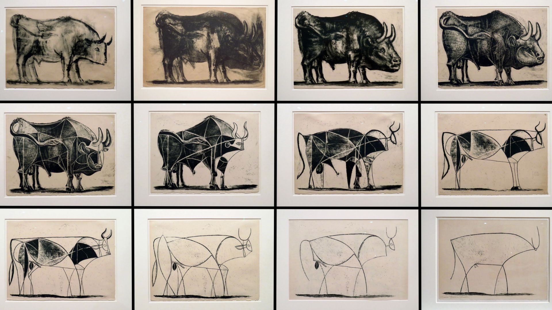
The way to view this work of art is one row at a time from left to right, moving top to bottom.
Picasso started with a realistic bull (first image, top left). Then he went through a series of iterations, removing details each time.
The final sketch is beautiful in its simplicity. Picasso strips away everything but a few simple lines to represent what is unquestionably a bull. It’s a bull in its most pure form, drawn by a visual genius.
Picasso has removed the unnecessary. Less is more.
Randy Nelson, a former Dean of Pixar University and member of the Faculty of Apple University, used this example as part of an internal course called Communicating at Apple.
Minimalism is integral to Apple products and its whole corporate philosophy. They always try to capture the essence of an idea in products which are as simple and intuitive as possible.
When Steve Jobs presented Apple’s new remote control in 2005, he showed that all the standard remote controls available at the time had more than 40 buttons.
Apple created a remote control with just six buttons: to go back and forth, turn the volume up or down, play or pause and select the menu. That’s it. It’s simplicity put into practice. Removing the unnecessary.
Like Picasso, they also went through a series of iterations and at every iteration kept removing buttons … to a point where only the essential ones were available.
So, what does this mean for you?
This idea of simplicity is not only important in product design, but also in presentation design. Designing by subtraction is key.
The French writer Antoine de Saint-Exupéry said: “Perfection is achieved, not when there is nothing more to add, but when there is nothing left to take away.”
Not only is simplicity in your designs more elegant, it also ensures that your slides don’t compete with what you’re saying verbally.
People can’t read and listen at the same time, so keep your slides simple and visual. One idea per slide is enough, like billboards.
Make sure your audience can understand the message behind your slides in no more than three seconds.
Your slides should be visual aids that support, reinforce and amplify your message. Remember, you are the presentation, not your slides.
What if I have to include more details?
Many presenters think that the above advice doesn’t apply to them. They insist that they need to do things their way, for their particular audience (who want to see more details on slides), or for their industry.
People tell me they need to have slides which can be displayed during their live presentation and be used as a handout afterwards.
If you’re one of those presenters, here’s the solution for you:
Separate, separate, separate.
Confident presenters separate.
What you say during a presentation (your words), what you show (your slides) and what you give (your handout) are three different things which should be separated.
Slides and documents are different and should be used for different purposes.
Confident presenters always keep their slides simple and visual. If the audience requires more detail, they will have a handout prepared which they can distribute before, during or after the presentation (depending on the context).
The handout includes all the information and details, the slides remain simple.
Pick the right tools for the job. You don’t need a full set of fancy clubs to play a bit of crazy golf with your kids.
You should regard slides and documents as two separate tools for different purposes.
In summary, remember these three tips about slide design:
- Keep your slides simple
- Keep them visual without too much text (think billboards)
- Reserve handouts for more details
What next
If you found this article helpful, feel free to share your thoughts using the contact form below.
Please share the article with any friends or colleagues who might also benefit from it.
If you want to become a more confident presenter, take the Confident Presenter Scorecard. Answer simple Yes/No questions, get an instant score plus suggestions for improvement. It takes less than 3 minutes. Once you complete the scorecard, you’ll receive a free pdf copy of my best-selling book Confident Presenter.
Image: Vahe Martirosyan, Pasadena, Norton Simon Museum, Picasso P. The Bull, 1946. Attribution-ShareAlike 2.0 Generic (CC BY-SA 2.0). Creative Commons License