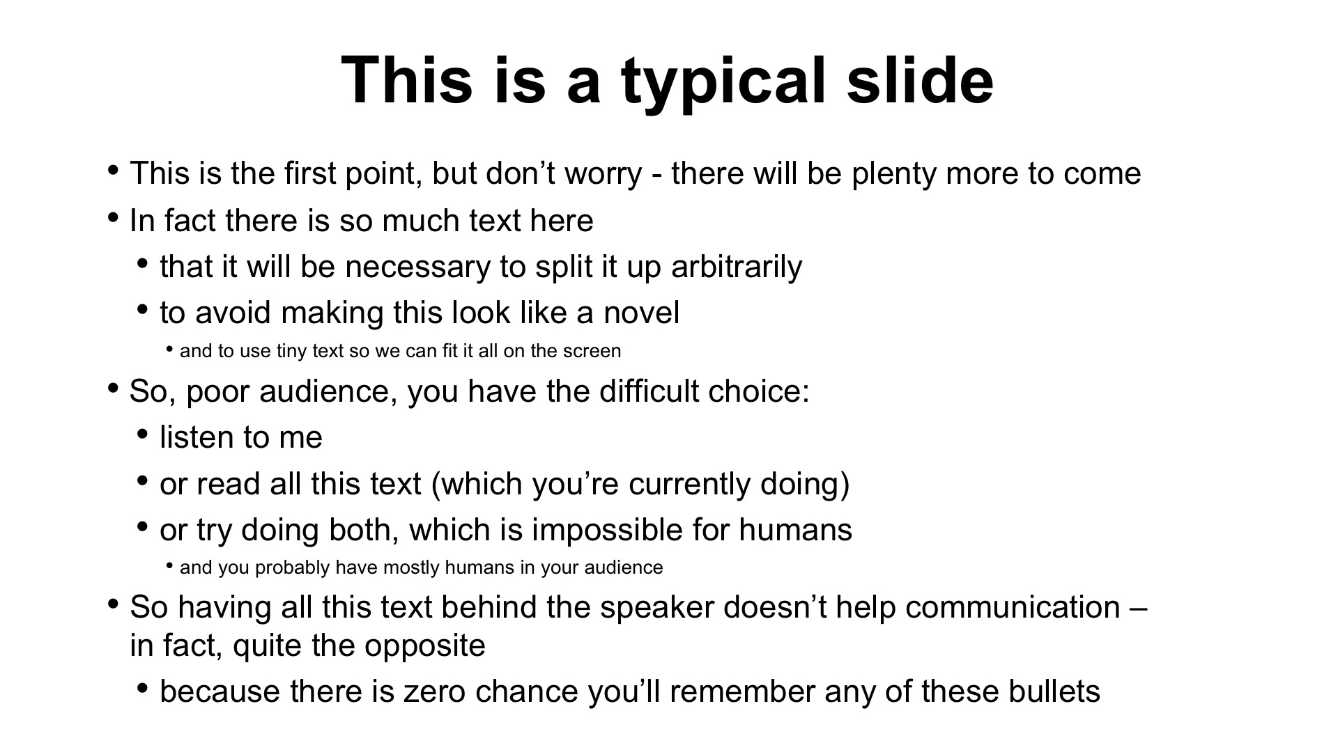
Slides can be an extremely powerful way of making your messages clearer and more memorable – yet all too often they are an obstacle to communication.
Humans can’t listen and read different things simultaneously: we can only process one linguistic input at a time. So if a slide features a lot of text and detail, it might make a useful reference document, but a terrible visual aid. On the other hand, if you keep your slides simple, with only a few words, they’ll be good visual aids but worthless as handouts.
So most people try to do something in the middle, and end up with not enough text to make for a useful reference document, but too much for a visual aid. 50% slide, 50% document, 0% effective. This is often known as a “slideument” – and it’s as horrible as it sounds.

When it comes to a presentation, it’s important to underline just how different slides and handouts need to be.
1. Slides are for projecting; handouts are for printing
For the audience, slides exist only as light projected on a screen for a short period of time, and they should be designed to work well on a projector screen, a flat screen monitor and/or an online meeting platform. Handouts, on the other hand, need to be designed so they can be printed if necessary.
2. Slides support an oral speech; handouts replace it
Good slides don’t stop the audience from listening; great slides help the audience to listen even more. Handouts, on the other hand, need to be standalone, i.e. clear and easy to understand for someone who missed the live presentation, or who is referring back to the content long after they forgot what the presenter said.
3. Slides are for looking at; handouts are for reading
Slides should be visual, allowing the brain’s linguistic processing to focus almost entirely on what the speaker is saying. Handouts, however, are intended for quiet reading: as there is no speaker to listen to, the brain can focus its linguistic processing on the document.
4. Slides feature only key words; handouts have complete sentences and even paragraphs
Visual slides will only have a few big words that we can understand quickly, so the audience can keep listening to the speaker. Handouts may feature full paragraphs so the reader can understand properly without ambiguity.
5. Slides often have dark backgrounds; handouts usually have white backgrounds
Good slides will often have dark backgrounds to avoid tiring the audience’s eyes. Most handouts, however, will have white backgrounds to make them easy to print without spending a fortune on toner or ink.
6. Slides should avoid ‘visual pollution’; handouts should feature meta-data
Items like the page number, the date or the author’s name are ‘visual pollution’ when projected on a screen, distracting the audience from what they should be looking at; yet in a handout, they are positive and helpful.
The obvious conclusion is that slides and handouts are so diametrically opposed in their objectives and characteristics that you couldn’t imagine trying to do both with one file. Or could you? Take a look at some of your recent slides and ask yourself whether you fell into the slideument trap.
I am often asked whether it’s acceptable to produce documents in PowerPoint. My answer: yes, as long as you don’t try to use them as slides, and as long as you share them as a PDF file. PowerPoint can be an excellent tool to produce visually attractive documents, such as proposals. At Ideas on Stage, we often produce document templates in PowerPoint for our clients. You just need to resist the temptation to project those documents: they are not visual aids.
If you are going to treat PowerPoint as a kind of Swiss Army knife, remember only to use one tool at a time. Trying to prepare a slide and a handout in one go will be as unsuccessful as trying to use the corkscrew and blade at the same time, except that the pain will be for your audience.
This is an extract from Business Presentation Revolution, by Phil Waknell, published on July 14th 2021. Why wait? Get the introduction free, today, and discover a better way of presenting.