How to use slides effectively in online meetings
It’s no secret that most slide presentations are boring, ineffective wastes of time. PowerPoint isn’t the problem - it’s how people (mis)use it.

In fact most business meetings would do well to avoid slides - and presentations - altogether. Meetings should be for discussion, connection, decisions… not for information-sharing. Using a wonderfully-crafted PowerPoint deck to share information is like using an iPad Pro as a frisbee: sure, it’s well-designed and better than most other tablets, but it’s still the wrong tool for the job. Just give people a document with full sentences, and time to read it. Far more effective.
When it comes to online meetings, however, slides can be especially useful. Virtual Meeting Revolution #4 states: Use documents for information, slides for attention.
First of all, this means you should use a real document to share any information the participants need. You might summarize some key points in some slides to show during the meeting, but this should just be a reminder, not the main source of information. Showing stuff in bullet-points during a meeting is not a“proof of communication”: it’s evidence of poor communication unless the information was shared properly elsewhere.
So what do you use slides for? Attention. Gaining participants’ attention, keeping it, and directing it.
The usual slide success criteria apply, so we can borrow these from our bestselling Business Presentation Revolution course:
- SIMPLE: One simple question or message per slide, easy to understand in five seconds
- CLEAR: Every element on your slide is easy to read/see at the back of the room
- ORIGINAL: Stand out, be different, and make people feel a sense of discovery with every click
- RELATED: Your slide must be related to what you are saying right then - not before or after
- ENJOYABLE: Well prepared, pleasant to look at, and worthy of your company’s visual identity
In fact, they are even more important in online meetings. If slides are for attention, then they are vital because it’s very hard to keep people’s attention when you can’t see them, and they know you can’t see them. (Video meetings are great but too many people don’t switch on their video, and when you’re sharing your screen/slides, usually you can’t see everyone. And they know that.)
This means that you need to make an extra effort to make your slides Original and Enjoyable. If people like what they see, and get an emotional reaction from it, they will be less likely to switch their attention to something else. And ensure everything is Clear: they may not be sitting a long way from the screen like in a physical meeting room, but they might be watching on their smartphone, so if your text or numbers aren’t clear on a phone-sized screen, they’re not clear enough.
There are some additional points to bear in mind, though, which are specific to online meetings. Here are three things to avoid, and three things to use in virtual meetings.
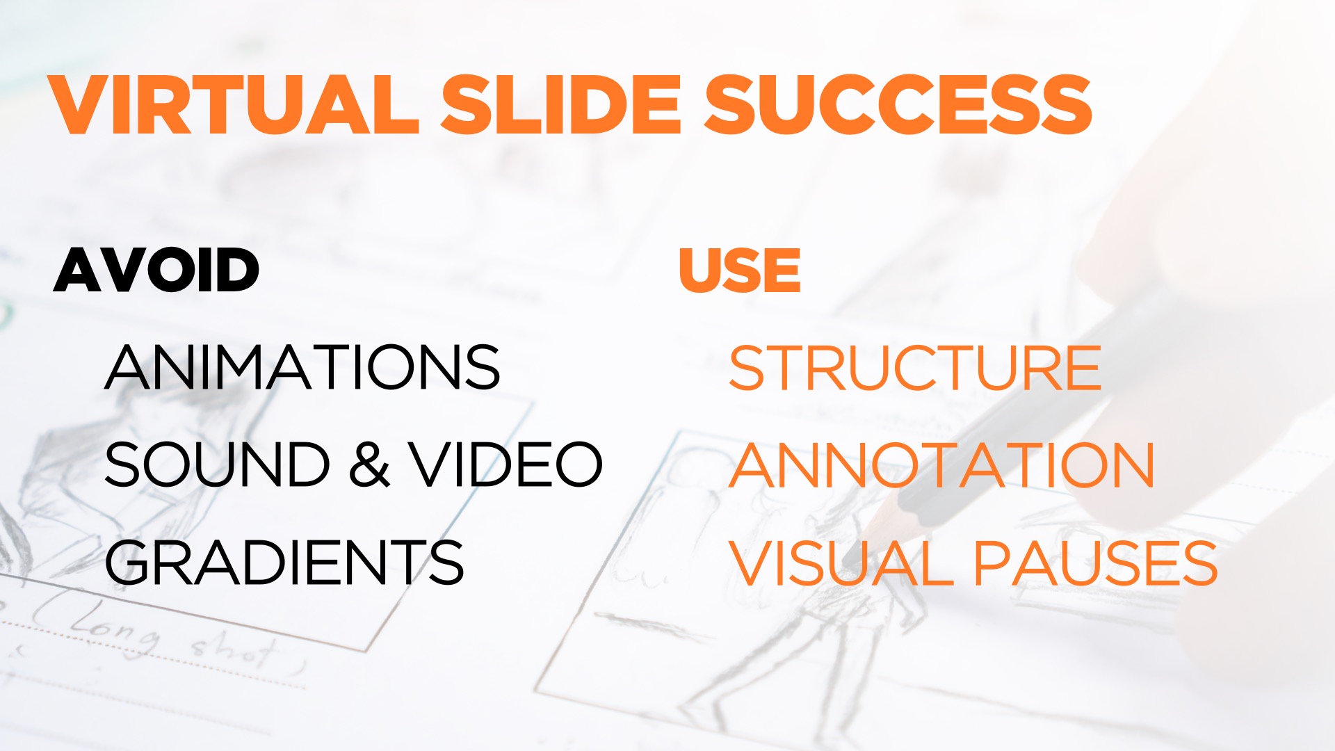
- AVOID TRANSITIONS AND ANIMATIONS: Even a basic dissolve transition does not always look good in online meetings where the screen refresh rate is not as good as it is on your own screen. By all means have things appear at the right time on your slide using the Animation function in PowerPoint, but only use the Appear animation so the participants don’t see a failed attempt at movement, or zooming, or fading (and definitely no bouncing).
- AVOID SOUNDS AND VIDEOS: For the same reason of poor screen refresh rate, and the added reason of sound quality issues, avoid showing videos in online meetings. They’re great if you’re in the same room (although I usually avoid video if the room uses ClickShare which also suffers from the refresh rate issue, meaning video seems jerky), but not good online. Don’t use sound effects either. Also, this should go without saying, but please: no animated GIFs!
- AVOID GRADIENTS: Gradient backgrounds can look very good on your screen: this is where the background fades from one color at the top of the screen to another at the bottom, for example. When you share your screen online, what the participants see is often a lower-resolution version of your slides, with lower color definition. This means that what you see as a smooth gradient may be seen by others as a series of horizontal bands. It doesn’t look nearly as good. Best to avoid gradients in online meetings.
- USE STRUCTURE SLIDES: It’s important to use your slides to ensure participants are not lost. Let’s be honest, some people might get distracted by an important email, or phone call, or child, and miss a few minutes of your meeting. Don’t let them get lost. Ensure that you regularly show a slide that gives participants the meeting agenda or structure, and highlights where you are now. Even if you’re just sharing the agenda and then discussing for 15 minutes without advancing the slide, this can be useful: it’s the equivalent of having the agenda on a flip-chart in a physical meeting room, and it can help to focus participants’ attention.
- USE ANNOTATIONS: You can’t use a laser to point to a part of your slide as you would in a meeting room, but there are even better tools available. You can use the native PowerPoint tools to highlight things, outline them etc, and some online systems like Zoom also give the presenter some controls to use a highlighting function. Experiment with them to see what works for you.
- USE VISUAL PAUSES: We love black slides so much we call them The World’s Best Slide. In a face-to-face presentation, just inserting a simple black slide is like a visual pause, as if the screen or projector is temporarily switched off and the audience can focus right back on the speaker. You don’t always need a slide to illustrate what you are saying. However, in an online meeting, if you show a pure black screen, people will think there’s a technical problem. You may choose instead to use a mostly blank slide with just your logo in the center. Or you could simply pause your screen sharing so people see you speaking instead of your slides, until you need the slides again. After all, the most important visual of all is you, with your expressions and gestures.
Always remember that slides are there to illustrate what you are saying, and to make it clearer, more meaningful and more memorable to the audience. You aren’t there to comment on slides, so always work out what to say before you think how you might illustrate it - if you need illustrations at all.
It’s only the meeting that’s supposed to be virtual; if their attention is virtual too, your meeting is probably just a waste of time. So we hope that if you follow this advice, you’ll be able to communicate effectively, and keep your audience’s attention throughout your online meetings.
If you need help producing effective slides for your online meetings or presentations, contact us using the form below, and our experienced PowerPoint designers will be happy to hear from you.