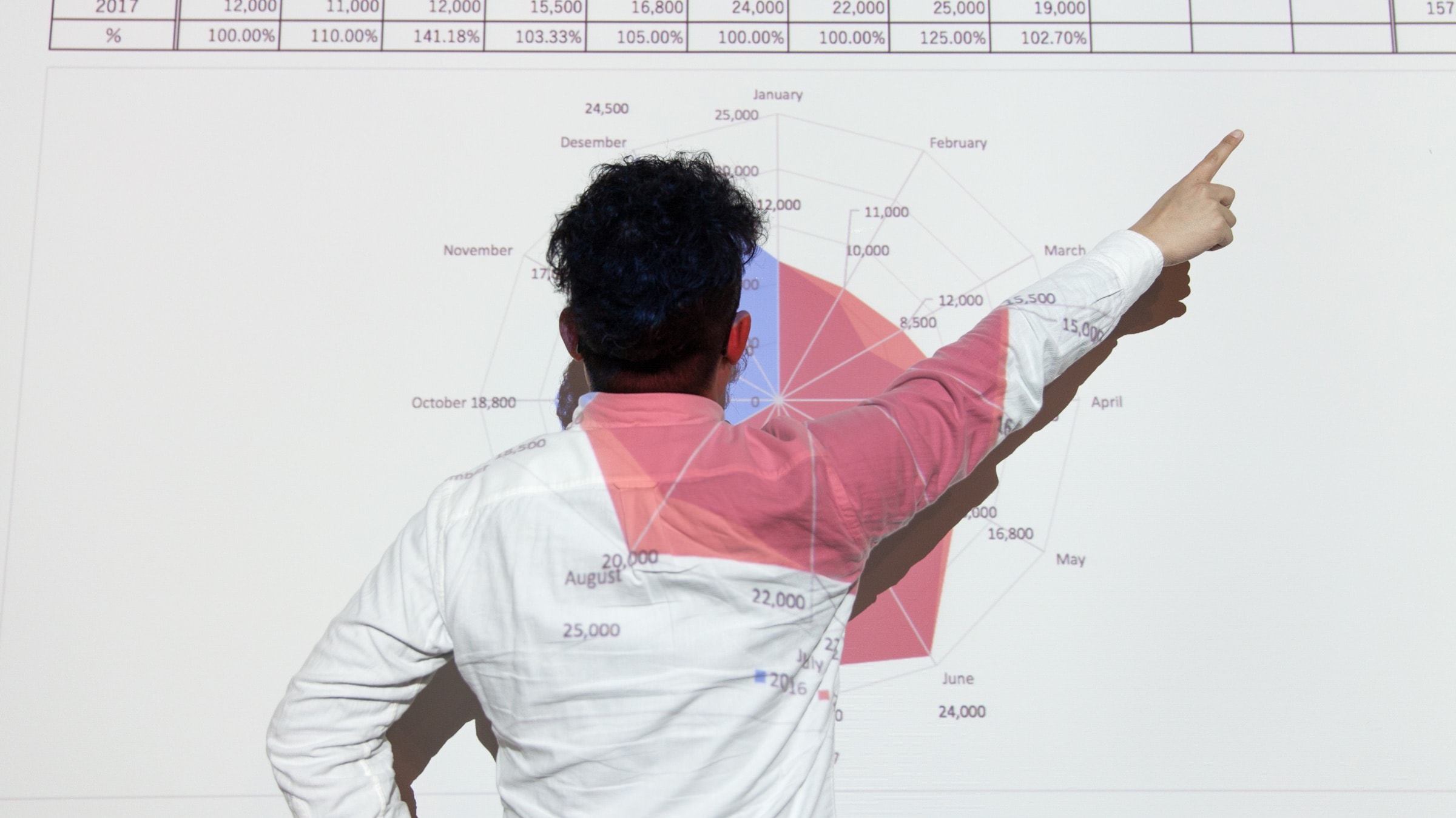
This is a quick list of seven common problems that we see with slides created by non specialists. However they are relatively easy to spot, and you don’t have to be a graphic designer to avoid them. Read on and your next slides will look much better!
- Too much content. The goal is not to cover every single inch with content. It’s not because you have some space left at the bottom of the slide that you should put something there. Leave ample white space, let your content breathe, it will give it importance.
- Irrelevant content. Now that you removed clutter, it’s time to ask yourself if the remaining content is really, really, really necessary and relevant to your presentation and to what you are going to say. Irrelevant content will just distract and confuse your audience.
- Content is too small. The basic rule is: if it’s too small to be readable, don’t put it on the slide. What’s the point of adding text in 9 points that nobody will be able to read? Even if relevant, if it cannot be read by your audience then it’s just visual noise. When designing your slides, take the size of the room and of the screen into account. If you are young don’t forget that older people often don’t see as well as you do, and need bigger text and graphics.
- Illogical visual flow. We have seen slides that put the key information in the bottom right corner. Or slides that had to be read bottom to top. Try to avoid those layouts if possible, in Western culture it’s preferable to put the most important elements at the top or center of the slide.
- Insufficient contrast. What looks legible on your high quality screen may look washed out on old projectors or brightly lit rooms. Always make sure that you have excellent contrast between background and content. Avoid busy backgrounds which reduce legibility. Don’t forget that white text, not colored text, is what offers the highest contrast on a dark background.
- Boring looking. You will just make your life unnecessary hard if you try to use boring, plain slides to keep your audience interested. Using beautiful pictures, original graphics, a small dose of animation and a few surprises will be much more efficient!
- Comic Sans. Please, don’t use that font. Even as a joke. Just don’t.
